Homely
Well, Microsoft has released Internet Explorer 7.0 Beta to the public this week. Although the browser has finally been upgraded to the technical level that Firefox has been for quite some time, it comes to no surprise that its ugly as hell. Microsoft makes decent products but my god do they need lessons in a) intuitive design b) style and c) ways to not make your products convoluted and ugly. Take a look for yourselves or check out their online tour.
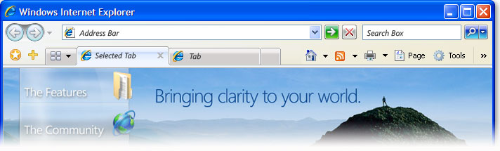 Consolidated menus run rampant in the design. I'm sorry but I don't want a sidebar and consolidated menu for my links and favorite sites. I also don't need buttons strewn across the entire screen. Put all the navigation buttons together on the top left side (forward, back, refresh, stop, home, and maybe print). Your tab bar looks like ass, not "clean, clear and streamlined" as the tour states. In fact, the new layout is the complete opposite of clean, clear and streamlined. I'd call it ugly, convoluted, and bloated.
If that isn't the ugliest browser (Opera comes close... so does Camino), then I better call Tom Cruise for some tips on how vitamins and exercise will help my psychiatric problems. IE 7.0 is just continuing the trend that was set by Longhorn and Vista of technically stunning yet visually disgusting interfaces. It's truly a sad state when Linux and open source software have more appealing interfaces. I think I'll just stick with Firefox.
posted by Aventius @ 2:41 AM
10 comments
![]()
![]()
10 Comments:
update...
somebody registered www.ie7.com and it displays a large picture of the Firefox icon.
I don't update my stuff purely b/c it looks dumber after. The new windows media player has like 4 hidden task bars and looks dumb as hell. Anyway, its still better than crapintosh
Windows media player is so much better than iTunes for managing music - wait, no.
As for browsers, if they're all equal in features then yes, I pick the better looking one. This is the same as other products you purchase. Between two vehicles that have identical features, you're not going to pick the ugly one.
Furthermore, Apple's Safari browser is the most visually attractive browser on the market in my opinion but, I don't use it because it has technical features that I don't like. For instance, I hate its implementation of RSS feeds.
Ok my third and last opinion... Bad style, bad design, and unintuitive design choices makes doing tasks take more time. Especially when you're trying to learn how to use the program.
Winamp > itunes
period
at least we agree that winamp > windows media player.
A security bug in Winamp is being exploited by miscreants to install spyware on machines running the media player software, experts have warned.
can you stream aqua teen hunger force, sealab, lost, arrested development, and the best webradio station radio paradise from i tunes? I think not
Can Winamp properly prepare, bake, and serve my favorite dish - Dead Baby Cacciatore? I didn't think so. But, iTunes can.
Post a Comment
<< Home